如何使用 forestplot 包绘制森林图展示多个效应的大小
【简说基因】森林图可以展示多个研究结果的效应大小和置信区间。
大约是上周,有小伙伴问我要画森林图的代码,顺手扔了一个脚本过去。后面意识到,这祖传代码似乎很久没更新了。今天这篇文章就来学一学 forestplot 这个专门画森林的包。
文本
library(forestplot)
library(dplyr)
文本表
forestplot 可以利用文本表画图:
# Cochrane data from the 'rmeta'-package
base_data <- tibble::tibble(mean  = c(0.578, 0.165, 0.246, 0.700, 0.348, 0.139, 1.017),lower = c(0.372, 0.018, 0.072, 0.333, 0.083, 0.016, 0.365),upper = c(0.898, 1.517, 0.833, 1.474, 1.455, 1.209, 2.831),study = c("Auckland", "Block", "Doran", "Gamsu","Morrison", "Papageorgiou", "Tauesch"),deaths_steroid = c("36", "1", "4", "14", "3", "1", "8"),deaths_placebo = c("60", "5", "11", "20", "7", "7", "10"),OR = c("0.58", "0.16", "0.25", "0.70", "0.35", "0.14", "1.02"))base_data |>forestplot(labeltext = c(study, deaths_steroid, deaths_placebo, OR),clip = c(0.1, 2.5),xlog = TRUE) |>fp_set_style(box = "royalblue",line = "darkblue",summary = "royalblue") |>fp_add_header(study = c("", "Study"),deaths_steroid = c("Deaths", "(steroid)"),deaths_placebo = c("Deaths", "(placebo)"),OR = c("", "OR")) |>fp_append_row(mean  = 0.531,lower = 0.386,upper = 0.731,study = "Summary",OR = "0.53",is.summary = TRUE) |>fp_set_zebra_style("#EFEFEF")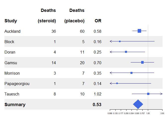
汇总线
为汇总行添加线条,得到的森林图类似一个三线表:
base_data |>forestplot(labeltext = c(study, deaths_steroid, deaths_placebo, OR),clip = c(0.1, 2.5),xlog = TRUE) |>fp_add_lines() |>fp_set_style(box = "royalblue",line = "darkblue",summary = "royalblue",align = "lrrr",hrz_lines = "#999999") |>fp_add_header(study = c("", "Study"),deaths_steroid = c("Deaths", "(steroid)") |>fp_align_center(),deaths_placebo = c("Deaths", "(placebo)") |>fp_align_center(),OR = c("", fp_align_center("OR"))) |>fp_append_row(mean = 0.531,lower = 0.386,upper = 0.731,study = "Summary",OR = "0.53",is.summary = TRUE)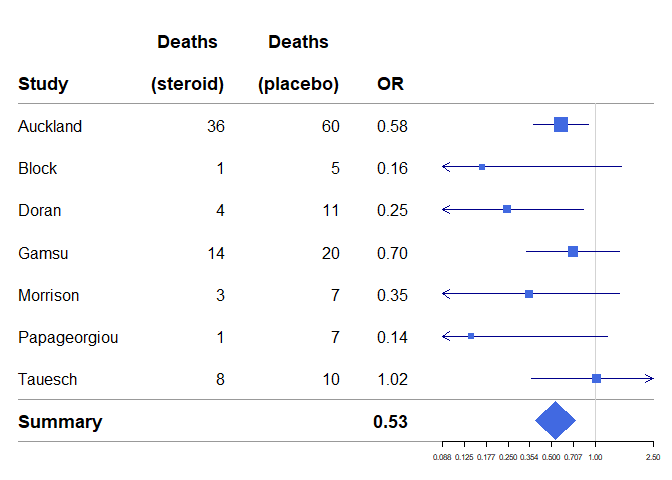
当然汇总线还可以是另外的形式:
base_data |>forestplot(labeltext = c(study, deaths_steroid, deaths_placebo, OR),clip = c(0.1, 2.5),xlog = TRUE) |>fp_add_lines(h_3 = gpar(lty = 2),h_11 = gpar(lwd = 1, columns = 1:4, col = "#000044")) |>fp_set_style(box = "royalblue",line = "darkblue",summary = "royalblue",align = "lrrr",hrz_lines = "#999999") |>fp_add_header(study = c("", "Study"),deaths_steroid = c("Deaths", "(steroid)") |>fp_align_center(),deaths_placebo = c("Deaths", "(placebo)") |>fp_align_center(),OR = c("", fp_align_center("OR"))) |>fp_append_row(mean = 0.531,lower = 0.386,upper = 0.731,study = "Summary",OR = "0.53",is.summary = TRUE)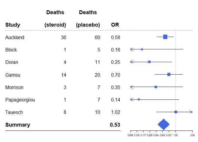
向须线添加顶点
base_data |>forestplot(labeltext = c(study, deaths_steroid, deaths_placebo, OR),clip = c(0.1, 2.5),vertices = TRUE,xlog = TRUE) |>fp_add_lines(h_3 = gpar(lty = 2),h_11 = gpar(lwd = 1, columns = 1:4, col = "#000044")) |>fp_set_style(box = "royalblue",line = "darkblue",summary = "royalblue",align = "lrrr",hrz_lines = "#999999") |>fp_add_header(study = c("", "Study"),deaths_steroid = c("Deaths", "(steroid)") |>fp_align_center(),deaths_placebo = c("Deaths", "(placebo)") |>fp_align_center(),OR = c("", fp_align_center("OR"))) |>fp_append_row(mean = 0.531,lower = 0.386,upper = 0.731,study = "Summary",OR = "0.53",is.summary = TRUE)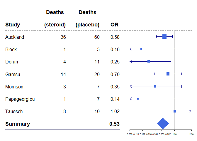
定位图形元素
base_data |>forestplot(labeltext = c(study, deaths_steroid, deaths_placebo, OR),clip = c(0.1, 2.5),vertices = TRUE,xlog = TRUE) |>fp_add_lines(h_3 = gpar(lty = 2),h_11 = gpar(lwd = 1, columns = 1:4, col = "#000044")) |>fp_set_style(box = "royalblue",line = "darkblue",summary = "royalblue",hrz_lines = "#999999") |>fp_add_header(study = c("", "Study"),deaths_steroid = c("Deaths", "(steroid)"),deaths_placebo = c("Deaths", "(placebo)"),OR = c("", "OR")) |>fp_append_row(mean = 0.531,lower = 0.386,upper = 0.731,study = "Summary",OR = "0.53",is.summary = TRUE) |>fp_decorate_graph(box = gpar(lty = 2, col = "lightgray"),graph.pos = 4) |>fp_set_zebra_style("#f9f9f9")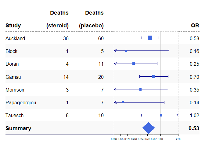
使用表达式
如果我们给出一个回归输出,有时使用非 ascii 字母会很方便。在本节中,我们将使用我的研究,比较瑞典和丹麦全髋关节置换术后 1 年的健康相关生活质量:
data(dfHRQoL)dfHRQoL |>filter(group == "Sweden") |>mutate(est = sprintf("%.2f", mean), .after = labeltext) |>forestplot(labeltext = c(labeltext, est),xlab = "EQ-5D index") |>fp_add_header(est = expression(beta)) |>fp_set_style(box = "royalblue",line = "darkblue",summary = "royalblue")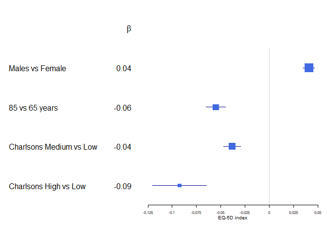
改变字体
改变字体可能会给表格给予完全不同的感觉:
# You can set directly the font to desired value, the next three lines are just for handling MacOs on CRAN
font <- "mono"
if (grepl("Ubuntu", Sys.info()["version"])) {font <- "HersheyGothicEnglish"
}
dfHRQoL |>filter(group == "Sweden") |>mutate(est = sprintf("%.2f", mean), .after = labeltext) |>forestplot(labeltext = c(labeltext, est),xlab = "EQ-5D index") |>fp_add_header(est = "Est.") |>fp_set_style(box = "royalblue",line = "darkblue",summary = "royalblue",txt_gp = fpTxtGp(label = gpar(fontfamily = font)))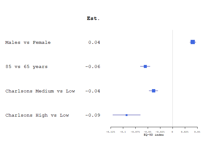
置信区间
有时候置信超过了一定范围,可以通过添加一个箭头,截断置信区间:
dfHRQoL |>filter(group == "Sweden") |>mutate(est = sprintf("%.2f", mean), .after = labeltext) |>forestplot(labeltext = c(labeltext, est),clip = c(-.1, Inf),xlab = "EQ-5D index") |>fp_set_style(box = "royalblue",line = "darkblue",summary = "royalblue")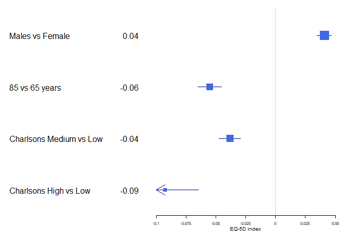
自定义盒子大小
dfHRQoL |>filter(group == "Sweden") |>mutate(est = sprintf("%.2f", mean), .after = labeltext) |>forestplot(labeltext = c(labeltext, est),boxsize = 0.2,clip = c(-.1, Inf),xlab = "EQ-5D index") |>fp_set_style(box = "royalblue",line = "darkblue",summary = "royalblue")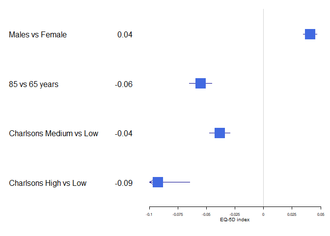
如果您想保持相对大小,则需要为转换框的 draw 函数提供包装器。下面展示了如何做到这一点,以及如何将多个 forestplots 合并到一个图像中:
fp_sweden <- dfHRQoL |>filter(group == "Sweden") |>mutate(est = sprintf("%.2f", mean), .after = labeltext) |>forestplot(labeltext = c(labeltext, est),title = "Sweden",clip = c(-.1, Inf),xlab = "EQ-5D index",new_page = FALSE)fp_denmark <- dfHRQoL |>filter(group == "Denmark") |>mutate(est = sprintf("%.2f", mean), .after = labeltext) |>forestplot(labeltext = c(labeltext, est),title = "Denmark",clip = c(-.1, Inf),xlab = "EQ-5D index",new_page = FALSE)library(grid)
grid.newpage()
borderWidth <- unit(4, "pt")
width <- unit(convertX(unit(1, "npc") - borderWidth, unitTo = "npc", valueOnly = TRUE)/2, "npc")
pushViewport(viewport(layout = grid.layout(nrow = 1,ncol = 3,widths = unit.c(width,borderWidth,width))))
pushViewport(viewport(layout.pos.row = 1,layout.pos.col = 1))
fp_sweden |>fp_set_style(box = "royalblue",line = "darkblue",summary = "royalblue")
upViewport()
pushViewport(viewport(layout.pos.row = 1,layout.pos.col = 2))
grid.rect(gp = gpar(fill = "#dddddd", col = "#eeeeee"))
upViewport()
pushViewport(viewport(layout.pos.row = 1,layout.pos.col = 3))
fp_denmark |>fp_set_style(box = "royalblue",line = "darkblue",summary = "royalblue")
upViewport(2)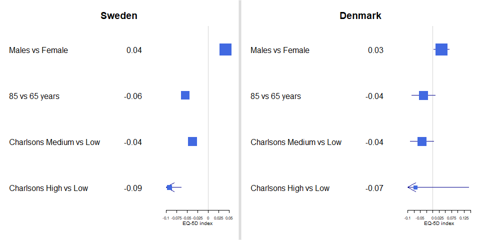
多个置信带
dfHRQoL |>group_by(group) |>forestplot(clip = c(-.1, 0.075),ci.vertices = TRUE,ci.vertices.height = 0.05,boxsize = .1,xlab = "EQ-5D index") |>fp_add_lines("steelblue") |>fp_add_header("Variable") |>fp_set_style(box = c("blue", "darkred") |> lapply(function(x) gpar(fill = x, col = "#555555")),default = gpar(vertices = TRUE))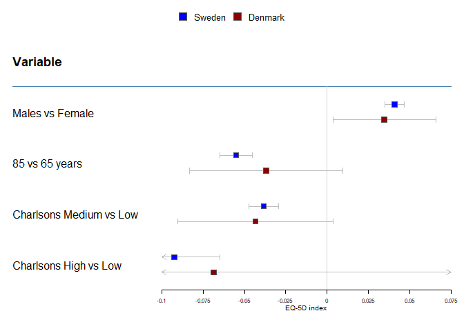
估算指标
可以在许多不同的估计指标之间进行选择。使用上面的示例,我们可以将丹麦结果设置为圆形。
dfHRQoL |>group_by(group) |>forestplot(fn.ci_norm = c(fpDrawNormalCI, fpDrawCircleCI),boxsize = .25, # We set the box size to better visualize the typeline.margin = .1, # We need to add this to avoid crowdingclip = c(-.125, 0.075),xlab = "EQ-5D index") |>fp_set_style(box = c("blue", "darkred") |> lapply(function(x) gpar(fill = x, col = "#555555")),default = gpar(vertices = TRUE)) |>fp_set_zebra_style("#F5F9F9")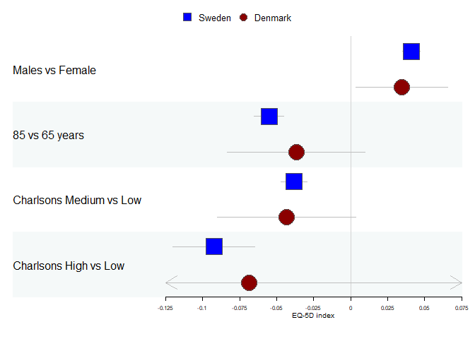
选择线型
dfHRQoL |>group_by(group) |>forestplot(fn.ci_norm = c(fpDrawNormalCI, fpDrawCircleCI),boxsize = .25, # We set the box size to better visualize the typeline.margin = .1, # We need to add this to avoid crowdingclip = c(-.125, 0.075),lty.ci = c(1, 2),xlab = "EQ-5D index") |>fp_set_style(box = c("blue", "darkred") |> lapply(function(x) gpar(fill = x, col = "#555555")),default = gpar(vertices = TRUE))
图例
图例在使用 group_by 时自动添加,但我们也可以通过 legend 参数直接控制它们:
dfHRQoL |>group_by(group) |>forestplot(legend = c("Swedes", "Danes"),fn.ci_norm = c(fpDrawNormalCI, fpDrawCircleCI),boxsize = .25, # We set the box size to better visualize the typeline.margin = .1, # We need to add this to avoid crowdingclip = c(-.125, 0.075),xlab = "EQ-5D index") |>fp_set_style(box = c("blue", "darkred") |> lapply(function(x) gpar(fill = x, col = "#555555")))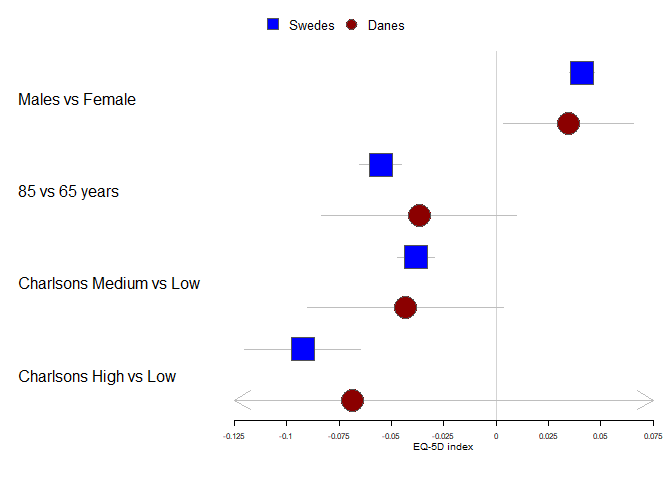
可以通过使用 fpLegend 函数设置 legend_args 参数来进一步自定义:
dfHRQoL |>group_by(group) |>forestplot(legend = c("Swedes", "Danes"),legend_args = fpLegend(pos = list(x = .85, y = 0.25),gp = gpar(col = "#CCCCCC", fill = "#F9F9F9")),fn.ci_norm = c(fpDrawNormalCI, fpDrawCircleCI),boxsize = .25, # We set the box size to better visualize the typeline.margin = .1, # We need to add this to avoid crowdingclip = c(-.125, 0.075),xlab = "EQ-5D index") |>fp_set_style(box = c("blue", "darkred") |> lapply(function(x) gpar(fill = x, col = "#555555")))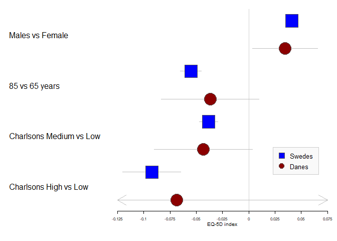
其他
如果自动化的刻度与所需的不匹配,可以使用 xticks 参数轻松更改:
dfHRQoL |>group_by(group) |>forestplot(fn.ci_norm = c(fpDrawNormalCI, fpDrawCircleCI),boxsize = .25, # We set the box size to better visualize the typeline.margin = .1, # We need to add this to avoid crowdingclip = c(-.125, 0.075),xticks = c(-.1, -0.05, 0, .05),xlab = "EQ-5D index") |>fp_set_style(box = c("blue", "darkred") |> lapply(function(x) gpar(fill = x, col = "#555555")))
通过向刻度添加“labels”属性,可以进一步定制刻度,这里有一个例子,它抑制了每隔一个刻度的刻度文本:
xticks <- seq(from = -.1, to = .05, by = 0.025)
xtlab <- rep(c(TRUE, FALSE), length.out = length(xticks))
attr(xticks, "labels") <- xtlabdfHRQoL |>group_by(group) |>forestplot(fn.ci_norm = c(fpDrawNormalCI, fpDrawCircleCI),boxsize = .25, # We set the box size to better visualize the typeline.margin = .1, # We need to add this to avoid crowdingclip = c(-.125, 0.075),xticks = xticks,xlab = "EQ-5D index") |>fp_set_style(box = c("blue", "darkred") |> lapply(function(x) gpar(fill = x, col = "#555555")))
有时你有一个非常高的图形,你想添加辅助线,以便更容易看到刻度线:
dfHRQoL |>group_by(group) |>forestplot(fn.ci_norm = c(fpDrawNormalCI, fpDrawCircleCI),boxsize = .25, # We set the box size to better visualize the typeline.margin = .1, # We need to add this to avoid crowdingclip = c(-.125, 0.075),xticks = c(-.1, -0.05, 0, .05),zero = 0,xlab = "EQ-5D index") |>fp_set_style(box = c("blue", "darkred") |> lapply(function(x) gpar(fill = x, col = "#555555"))) |>fp_decorate_graph(grid = structure(c(-.1, -.05, .05),gp = gpar(lty = 2, col = "#CCCCFF")))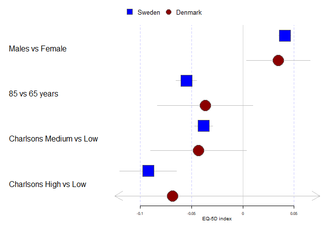
通过将 gpar 对象添加到 vector 中,可以轻松地自定义要使用的网格线以及它们应该是什么类型:
dfHRQoL |>group_by(group) |>forestplot(fn.ci_norm = c(fpDrawNormalCI, fpDrawCircleCI),boxsize = .25, # We set the box size to better visualize the typeline.margin = .1, # We need to add this to avoid crowdingclip = c(-.125, 0.075),xlab = "EQ-5D index") |>fp_set_style(box = c("blue", "darkred") |> lapply(function(x) gpar(fill = x, col = "#555555"))) |>fp_decorate_graph(grid = structure(c(-.1, -.05, .05),gp = gpar(lty = 2, col = "#CCCCFF")))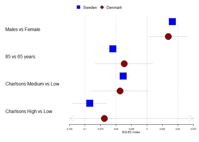
如果你不熟悉结构调用,它相当于生成一个向量,然后设置一个属性,例如:
grid_arg <- c(-.1, -.05, .05)
attr(grid_arg, "gp") <- gpar(lty = 2, col = "#CCCCFF")identical(grid_arg,structure(c(-.1, -.05, .05),gp = gpar(lty = 2, col = "#CCCCFF")))
# Returns TRUE
参考文献:
https://cran.r-project.org/web/packages/forestplot/vignettes/forestplot.html