
css实现炫酷充电动画
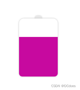
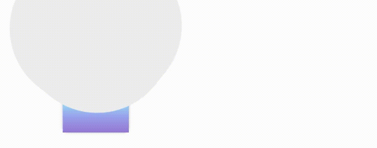
先绘制一个电池,电池头部和电池的身体

这里其实就是两个div,使用z-index改变层级,电池的身体盖住头部,圆角使用border-radius完成
html部分,完整的css部分在最后
绘制电池的css部分
.chargerBox{width: 200px;height: 200px;background: #eee;margin: 30px;padding: 50px;.chargerHead{width: 20px;height: 20px;background: #e9e9e9;border-radius: 4px;margin: 0 auto;box-shadow: 0px 0px 6px -2px #6d6d6d;animation: light 1s forwards linear 25s;}.chargerBody{width: 120px;height: 180px;margin: 0 auto;margin-top: -12px;border-radius: 15px 15px 10px 10px;z-index: 10;background-color: #fff;box-shadow: 0px 0px 6px -2px #6d6d6d;}
}
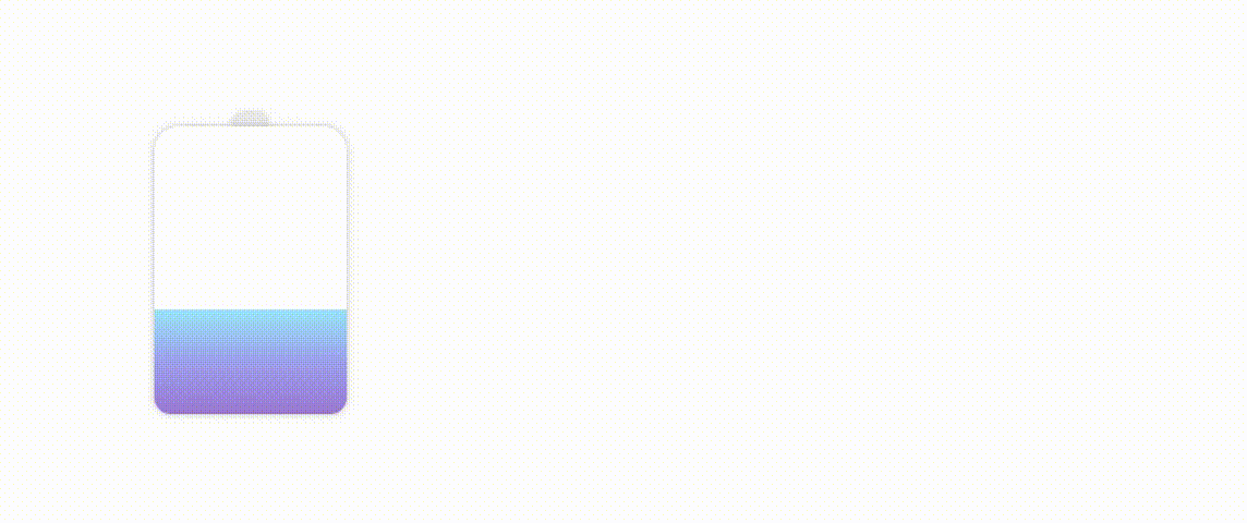
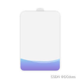
绘制完身体后开始给电池充电,让电池身体内部动起来。
给电池内部添加一个div,div的初始高度为0,随着动画的播放,慢慢的充满电池
这里充电的颜色可以改成渐变,随着电量的饱和,渐变的颜色也会随之更改,linear-gradient渐变是不能直接更改颜色的,这里可以使用 filter: hue-rotate();来修改图像的色相值,从而达到渐变动画的效果。
下面是充电部分的代码:
.water{width: 120px;height: 10px;position: absolute;bottom: 0;background: linear-gradient(0deg,#7F7FD5,#86A8E7,#91eae4);filter: hue-rotate(0deg);  /**关于渐变,普通的颜色更改是无效的,只能通过filter:hue-rotate色相旋转来实现颜色变化,初始不变 */animation: riseWater 20s forwards  linear;left: 50%;transform: translateX(-50%);
}
@keyframes riseWater {from {height: 10px;}to {height: 100%;filter: hue-rotate(60deg);   /* 颜色变化 */}
}
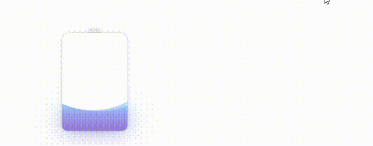
现在电池的电量已经充起来了,写到这里,充电的部分已经ok了,剩下的就是让电量动起来,像水一样流动
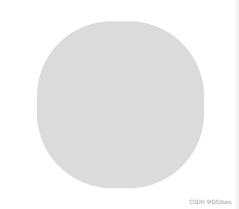
先绘制一个圆角矩形
border-radius: 45%
这个圆角矩形就是充电动画的关键,静止的时候其实看不出来它与水流有什么关联,咱们让它动起来观察一下
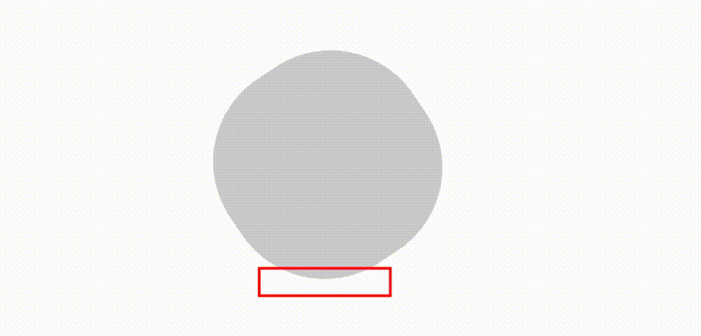
这一块就是水流动画的显示部分,白色的是水流,灰色的不展示,上一步中已经写好了充电的动画,这里只需要将该位置叠加到充电动画上面,即可完成充电的水流效果。
水流一般是多层的,所以这里可以再添加一个旋转的矩形,两个矩形旋转的角度和时长不同,并且更改其中一个矩形的rgba即可实现真实的水流效果。
.whiteBox{width: 300px;height: 300px;position: absolute;left: 50%;bottom: -10px;transform: translateX(-50%);animation: whiteBoxTop 25s forwards linear;&::before{content: '';width: 100%;height: 100%;position: absolute;background: #fff;border-radius: 45% ;animation: whiteSpin 5s infinite linear;}&::after{content: '';width: 101%;height: 101%;position: absolute;border-radius: 45% ;background: rgba(255,255,255,0.3);animation: whiteSpin2 7s infinite linear;}
}
@keyframes whiteBoxTop {from {bottom: 0;}to {bottom: 190px;}
}@keyframes whiteSpin {from {transform:rotate(0deg);}to {transform:rotate(360deg);}
}@keyframes whiteSpin2 {from {transform:rotate(0deg);}to {transform:rotate(360deg);}
}
注意:矩形的旋转必须是
360度的,否则会出现卡顿的情况,因为无限循环的动画第一次循环结束后会回到最初的起点,如果不是360度可能会发生旋转到某度(例如:200度)的时候度数重置到0,重新循环就会出现不流畅的画面。
做完水流动画后,给电池的头部加一个动画,延迟时间为充电设置的时间,当电池充满时,头部亮起表示电池已经充满。
我这里设置的充满时长为20s,这里需要延迟25s,因为水流的中间有凹陷的地方,所以延迟时间需要大于充满时长才行。
.chargerHead{width: 20px;height: 20px;background: #e9e9e9;border-radius: 4px;margin: 0 auto;z-index: 10;box-shadow: 0px 0px 6px -2px #6d6d6d;animation: light 1s forwards linear 25s; /*延迟25s*/}@keyframes light {from {background: #ffe793;}to {background: #ffe793;filter: contrast(200%); /*让头部亮起来 增加200%的饱和度*/}}
完成这些后,需要给电池增加渐变阴影,让电池有厚度感和真实感,这里创建一个div,大小和电池一致,通过给电池添加z-index使电池覆盖div,使用filter: blur(20px)来让底部的div高斯模糊从而实现阴影的效果,阴影和电池的颜色保持一致(动态渐变),并且div的动画时长和高度也和电池保持一致。
/* 渐变阴影 */
.shade{width: 120px;height: 0px;margin: 0 auto;margin-top: 0px;border-radius: 15px 15px 15px 15px;background: linear-gradient(0deg,#7F7FD5,#86A8E7,#91eae4);filter: blur(10px);animation: shadeBase 25s forwards linear;
}
@keyframes shadeBase {from {  height: 0px; margin-top: 0px;filter: blur(20px) hue-rotate(0deg);   /* 颜色变化 */ }to {  height: 180px; margin-top: -180px;  /*高度和电池一致*/filter: blur(20px) hue-rotate(60deg);   /* 颜色变化 */ }}
}
除了这种方案外,还可以使用box-shadow实现阴影,box-shadow使用rgba,在动画渲染的同时修改rgba来实现阴影颜色的变化。
@keyframes shadeBase {from { height: 0px; margin-top: 0px;box-shadow: 0px 0px 15px 10px rgba(143, 148, 227,0.2);}to { height: 180px; margin-top: -180px;box-shadow: 0px 5px 20px 5px rgba(203, 163, 238,0.8); }}
下面是css部分的代码
.chargerBox{width: 200px;height: 200px;margin: 30px;padding: 50px;.chargerHead{width: 20px;height: 20px;background: #e9e9e9;border-radius: 4px;margin: 0 auto;z-index: 10;box-shadow: 0px 0px 6px -2px #6d6d6d;animation: light 1s forwards linear 25s;}@keyframes light {from {background: #ffe793;}to {background: #ffe793;filter: contrast(200%);}}.chargerBody{width: 120px;height: 180px;margin: 0 auto;margin-top: -12px;border-radius: 15px 15px 10px 10px;z-index: 10;box-shadow: 0px 0px 6px -2px #6d6d6d;position: relative;overflow: hidden;.water{width: 120px;height: 10px;position: absolute;bottom: 0;background: linear-gradient(0deg,#7F7FD5,#86A8E7,#91eae4);filter: hue-rotate(0deg);  /**关于渐变,普通的颜色更改是无效的,只能通过filter:hue-rotate色相旋转来实现颜色变化,初始不变 */animation: riseWater 20s forwards  linear;left: 50%;transform: translateX(-50%);}@keyframes riseWater {from {height: 10px;}to {height: 100%;filter: hue-rotate(60deg);   /* 颜色变化 */}}.whiteBox{width: 300px;height: 300px;position: absolute;left: 50%;bottom: -10px;transform: translateX(-50%);animation: whiteBoxTop 25s forwards linear;&::before{content: '';width: 100%;height: 100%;position: absolute;background: #fff;border-radius: 45% ;animation: whiteSpin 5s infinite linear;}&::after{content: '';width: 101%;height: 101%;position: absolute;border-radius: 45% ;background: rgba(255,255,255,0.3);animation: whiteSpin2 7s infinite linear;}}@keyframes whiteBoxTop {from {bottom: 0;}to {bottom: 190px;}}@keyframes whiteSpin {from {transform:rotate(0deg);}to {transform:rotate(360deg);}}@keyframes whiteSpin2 {from {transform:rotate(0deg);}to {transform:rotate(360deg);}}}/* 渐变阴影 */.shade{width: 120px;height: 0px;margin: 0 auto;margin-top: 0px;border-radius: 15px 15px 15px 15px;background: linear-gradient(0deg,#7F7FD5,#86A8E7,#91eae4);filter: blur(10px);animation: shadeBase 25s forwards linear;}@keyframes shadeBase {from {  height: 0px; margin-top: 0px;filter: blur(20px) hue-rotate(0deg);   /* 颜色变化 */ }to {  height: 180px; margin-top: -180px;filter: blur(20px) hue-rotate(60deg);   /* 颜色变化 */ }}
}
该动画的灵感来自:https://github.com/chokcoco/iCSS/issues/75
案例源码:https://gitee.com/wang_fan_w/css-diary
如果觉得这篇文章对你有帮助,欢迎点赞、收藏、转发哦~